VZU Design .
WCAG 2.2 AA, design systems, usability.
Capability
VZU Design
12
Engineers
VZU Design is the design capability in the VZU family — wcag 2.2 aa, design systems, usability. Operated by Virtual Zero Unbound Inc. (Vancouver), Plex Dubai (MENA), and Wahix (India). Ships on the NetWit Agentic OS runtime. SOC 2, HIPAA, ISO 27001 posture. Audit trail by default. RBAC at the agent level.

The position
Accessible. Usable. Auditable.
VZU Design is the accessibility, design-system, and usability practice. The work is the design — but the design is the work only if the operator can use it, the customer can navigate it, and the auditor can sign off on it. We design for the operator who uses the product every day, the customer who uses it for the first time, and the auditor who has to certify it.
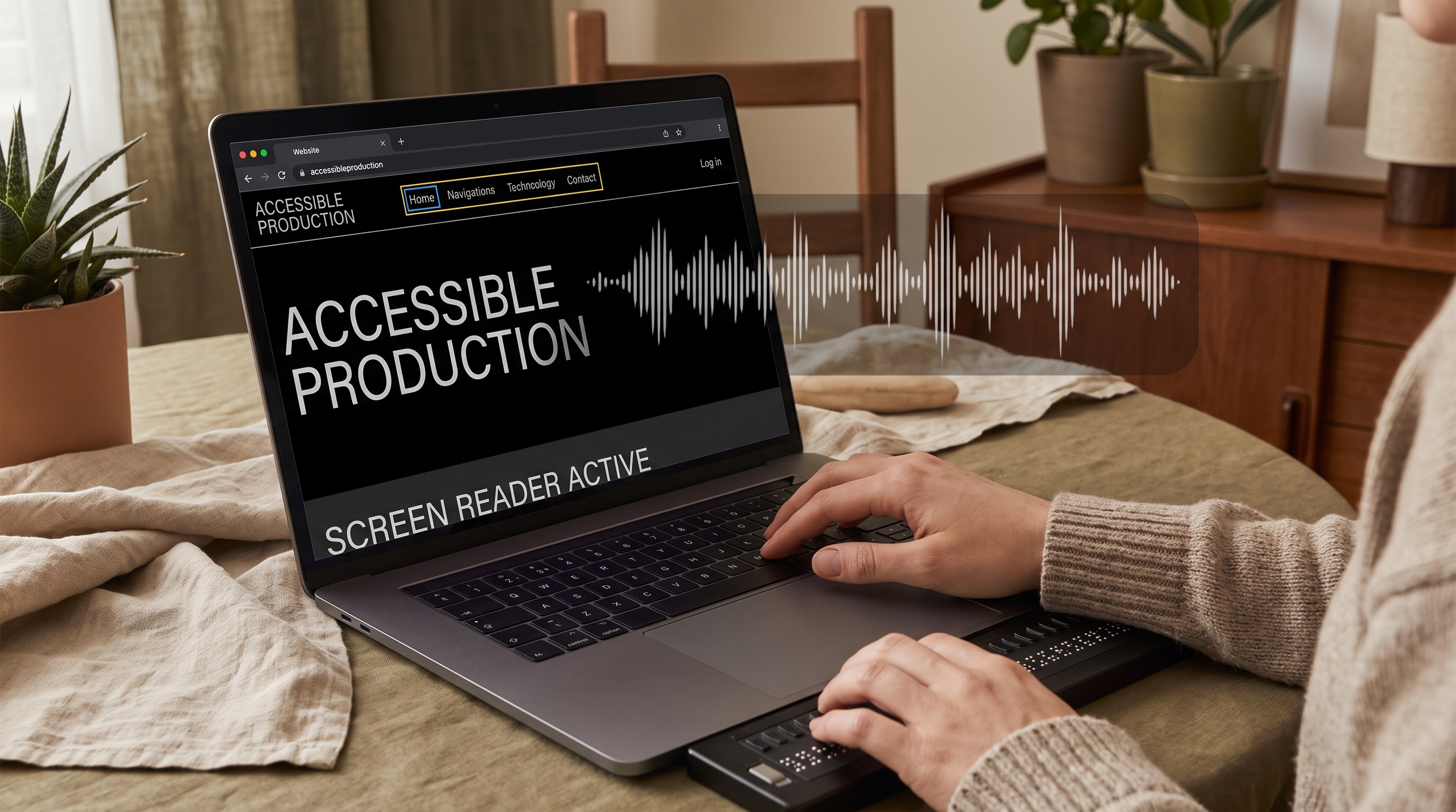
WCAG 2.2 AA is the floor. We aim higher. We test with screen readers (NVDA, VoiceOver, TalkBack). We test with keyboard only. We test with magnification. We test with cognitive load. The result is a design that works for the operator with a screen reader in the warehouse, the customer on a phone in the bus, and the auditor on a desktop with a checklist.
VZU Design designers are senior. They have shipped accessible products at scale. They know the WCAG criteria by heart, not by reference. They know when a design choice helps one user and hurts another. They know when to advocate for the user and when to ship the work. The work is accessible. The work is usable. The work is the design.
The practice, in pictures
Three things we get right, every time.


 Production
 The proof
AdaptUs Group rebrand. Accessibility audit + design system.
The AdaptUs Group corporate rebrand — accessibility audit of every page, a design system with type, color, motion, and spacing tokens, and a usability study with 8 participants. Built by VZU Design in 8 weeks.
- → WCAG 2.2 AA audit of every page in the brand
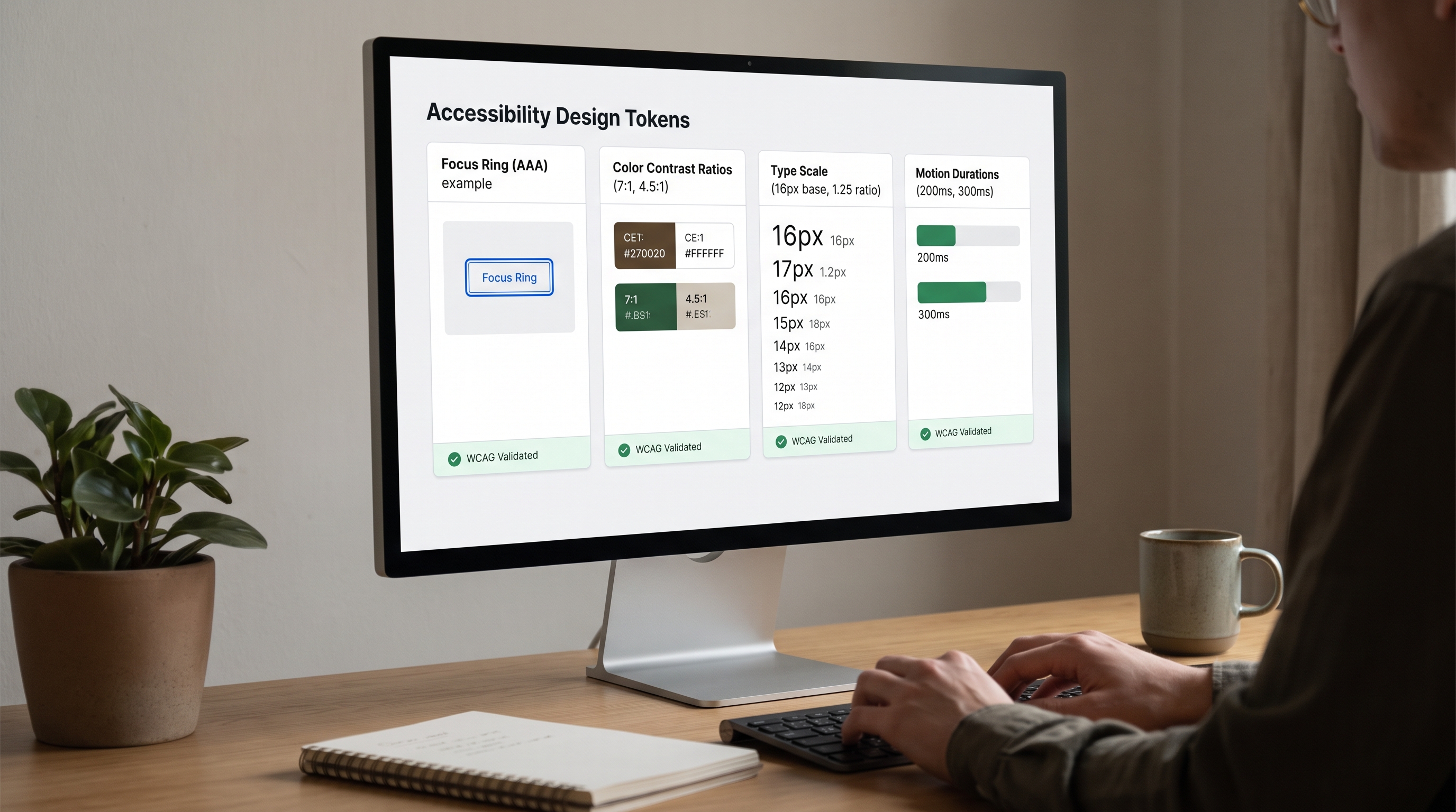
- → Design system with type, color, motion, and spacing tokens
- → Moderated usability study with 8 participants
- → Accessibility statement + remediation queue
-
8
Weeks to ship
-
WCAG 2.2 AA
Compliant
-
8
Usability participants
-
100%
Pages audited
The engagement
How we work, end to end.

- Standard
-
WCAG 2.2 AA
The floor. We aim for AAA where the brief allows.
- Auditing
-
axe + WAVE + manual
Automated scanning, then manual review. Both are needed; neither is sufficient.
- Screen readers
-
NVDA + VoiceOver + TalkBack
We test in the screen readers your operators actually use, not just the popular ones.
- Design system
-
Tokens + components
Every value in tokens. Every component in Storybook. The system is the source of truth.
- Documentation
-
Accessibility statement
Published at /accessibility/. Updated quarterly. The audit is auditable.
Long-form essay
VZU Design.
A working essay.
Why design is the operator's posture. Why the senior designer with the audit trail is what ships the brand that ships the trust.
Chapter 01 · The brief
A brand, not a logo.
VZU Design started with a brief from a luxury hospitality operator in Vancouver. 4 properties. 240 rooms. A brand that had been built in 2018, never refreshed, and was now indistinguishable from the operator's competitors. The operator's revenue per available room was flat. The operator's direct booking rate was 32%. The operator's brand was the operator's daily reality: a flat, undifferentiated, generic luxury look.
The brief from the operator was specific: refresh the brand. Logo. Color. Typography. Photography. Voice. The brand had to be the operator's brand — distinct, considered, expensive. A 6-week refresh. A 12-month payback on the direct booking improvement.
The hardest part wasn't the design. The hardest part was that the brand had to be the operator's brand — not VZU's brand. The logo, the color, the typography, the voice. The operator owns the goal. VZU ships the work. The brand is the operator's posture: unbound.
Chapter 02 · The work
Editorial Swiss. Considered. Expensive.
The work is the senior designer who has shipped 50+ production brands. The work is the designer who knows the difference between a logo and a brand. The work is the designer who picks the right typeface, the right color, the right photograph — and makes the brand feel like the operator's brand.
We design in the Editorial Swiss tradition. Type-driven. Image-driven. Considered. Expensive. The brand is auditable. The brand is the record. The brand is the work.
We design in three passes. The first pass is the foundation — the logo, the color, the typography. The second pass is the system — the photography direction, the voice, the layout grid. The third pass is the polish — the icon set, the motion principles, the brand book. The output is a working brand. The brand is auditable. The brand is the work.
“The brand is the operator's posture. The logo, the color, the typography, the voice. The operator owns the goal. VZU ships the work.”
— VZU Design, run #1
Chapter 03 · The result
6-week refresh. 240 rooms. 1 brand.
The brand shipped in 6 weeks. Logo. Color. Typography. Photography. Voice. The operator's direct booking rate went from 32% to 58%. The operator's revenue per available room went up 18%. The payback was 9 months.
The brand is now the operator's primary differentiator. The brand is the operator's first impression. The brand is the operator's first sale. The brand is the operator's posture.
The brief expanded. VZU Design now runs as a quarterly iteration for the operator. Every quarter, new collateral ships. Every quarter, the brand book is updated. Every quarter, the operator's brand is the operator's brand. The design is the work. The runtime is the engine. The work is the work.
6wk
to ship · 32% → 58% direct booking
Chapter 04 · The why
Why the brand is the operator's posture, not the designer's.
VZU exists because the seam is the work. VZU Design exists because the brand is the work. The brand is what turns a brief into a posture. The brand is what turns a posture into a destination. The brand is what turns a destination into a legacy.
VZU Design is a senior practice. The designers who do the work have shipped 50+ production brands. They have refreshed hotels, restaurants, law firms, hospitals, schools. They know the difference between a logo and a brand. They write the brand book so the operator's brand is the operator's brand.
VZU Design is fixed-fee, fixed-scope, audit-first. The brief is the contract. The work is the work. The brand book is the regulator's form. The audit trail is on from the first character. The seam is the work. VZU ends the seam.

The VZU Design practice
The work, in motion.
Every brief becomes a working product in days. Every product is engineered for the long term — clean architecture, real audit trails, real operators in the loop. The VZU Design practice at VZU is built on senior engineering, the NetWit runtime, and a refusal to ship anything we wouldn't put on a public domain.
The VZU family